They were instrumental during the arcade days – serving as flashy advertisements for each game. But nowadays, they endure due to force of habit more than anything else. At least in most cases. Other times, you can tell the love and effort devs put into the title screen. It’s something they wanted to have there – an overture for the game you’re about to experience – and you can tell right away. I personally love a good title screen that sells me the adventure, or gets me in the mood, or just captures the aesthetic of a game. So I’ve decided to rank some of the best ones based on their visuals, OST, and emotional impact.
25. Brütal Legend (2009)
Title screens should give players a glimpse of what a game is all about. And Brütal Legend is all about Jack Black and head-banger culture. Upon booting up the game, we’re greeted with a live-action POV cutscene where the legend himself leads us into his favorite record shop to show us an exceptional record titled “Brütal Legend.” Once we plop it down on the nearest table, we get to the actual title screen, where an impatient live-action hand waits for us to click on the “Start Game” sticker on an album cover.
24. Alien: Isolation (2014)
Alien: Isolation’s title screen highlights the game’s central theme by showing Sevastopol Station as a tiny trinket orbiting a massive planet. It reminds us how minor our character really is in the grand scheme of things. Protagonist Amanda may be the daughter of bad-ass legend Ellen Ripley, but that doesn’t change the fact that nobody will hear her scream if the Xenomorphs get her. This fantastic title screen was the perfect introduction to one of the best sci-fi horror games ever made.
23. Wii Sports (2006)
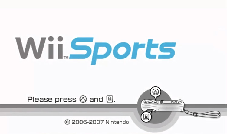
Video game title screens are a multimedia experience. It’s not only what you see on your display, but also what you hear coming from the speakers as you ponder whether to press start. Wii Sports’ title screen and menu design are clean and appealing, but they’re nothing memorable. The white and rounded edges make it feel like a tech demo. However, turn up the volume, and you’ll be blasted with pure nostalgia. The music in Wii Sports’ title screen is one of the most iconic sounds of the late 2000s.
22. God of War (2005)
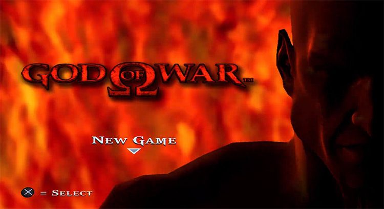
Many people complain title screens and even main menus are a relic of the past – something we should get rid of in favor of jumping straight into the action upon booting up the game. The original God of War found an interesting workaround by putting the title screen in the very middle of the action. The game starts with a zoomed-in take of Kratos’ angry and bloodthirsty face. Upon deciding to start a new game, the camera just zooms out to show Kratos jumping off the highest mountain in all of Greece.
21. Surgeon Simulator (2013)
Surgeon Simulator is one of those great games where everything is meant to be played with – including the title screen and main menu. Before you can get into the surgical action and start cutting people open, you get to play around on your character’s desk to warm up to the controls. You can check your files, manually swap out floppy discs to find valuable tips and cryptic clues, and even make phone calls if you’ve developed exceptional simulated motor skills. Alternatively, you can trash everything – as you will in the operating room.
20. Civilization IV (2005)
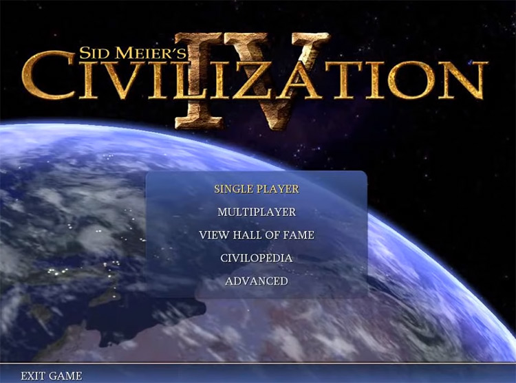
Civ IV’s opening screen sells us the dream of conquering the world with a satellite’s view of the earth. As time passes and night comes, you’ll see tiny lights pop up on the continents below – just like the fires of civilization have for tens of thousands of years. While that’s pretty cool on its own, it really comes together once you hear the moving sound of Baba Yetu slowly rise from your speakers. This orchestral version of The Lord’s Prayer in Swahili won video games their first Grammy award.
19. Metal Gear Solid 4: Guns of the Patriots (2008)
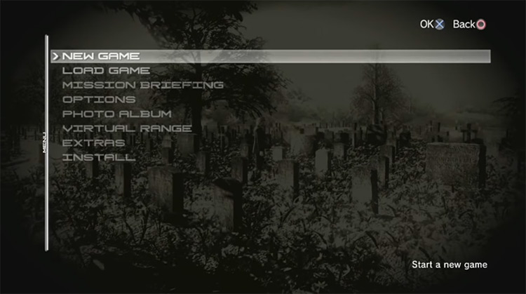
Creator Hideo Kojima’s games are known to follow a distinctly cinematographic approach to storytelling. Starting a story from the ending is common practice in cinema, and it works wonders in MGS4. A game doesn’t start after you press New Game – but rather, when you boot up the title screen. MGS4 opens with a mysterious but moving scene where Old Snake seems ready to end it all with his own hands. But why? And what happens next? You’ll have to play through the entire game to find out.
18. Metal Gear Solid V: The Phantom Pain (2015)
I’m a Metal Gear Solid fanboy through and through – so don’t be surprised to find more than one Tactical Espionage Title Screen in our list. Both MGSV: The Phantom Pain and its predecessor, MGSV: Ground Zeroes, share the same title screen – a shot of Big Boss riding on a chopper, waiting to drop into his next mission. While GZ’s is much more visually appealing thanks to the heavy use of dramatic lighting effects, the fact that TPP shows us Snake just as we last saw him – be it covered in dirt and blood or fresh from a bath at Mother Base – makes me much more excited to get back into the action.
17. Mario Kart 64 (1996)
“Welcome to Mario Kart!” Few phrases were as meaningful to seven-year-old me as this welcoming phrase from Mr. Video Games himself right at the beginning of Mario Kart 64. Mario is a man of few words. So when he does talk, his words carry weight. He sounds pleased and proud of what he’s about to show us. We know we’re about to play the good stuff – and the gorgeous artwork made it even more memorable. This is crystallized nostalgia.
16. Zero Tolerance (1994)
One of the least-known games on the list is Zero Tolerance – an exciting first-person shooter for the Sega Genesis. Unlike our current gaming landscape, there were barely any first-person shooters for 16-bit consoles – so Zero Tolerance had a golden opportunity to hit it out of the park. To advertise its non-stop alien shooting action, it employs a flashy animated title screen with the words ZERO TOLERANCE scrolling across the screen and illuminating the silhouette of a space commando from behind. To achieve something this cinematic and exciting with 16-bit graphics is a feat.
15. Sonic the Hedgehog (1991)
If we’re talking 16-bit masterpieces on the Sega Genesis, we’ve got to mention Sonic the Hedgehog. The original title screen for this high-speed side-scrolling platformer evoked the idea of speed with bright colors and bold design choices. I’m no expert, but let’s just say it’s not an accident that Sonic’s original logo has the same color palette as a can of Red Bull. This iconic emblem is shown soaring high above the water to reflect the unbridled freedom Sonic is all about.
14. Mega Man 2 (1989)
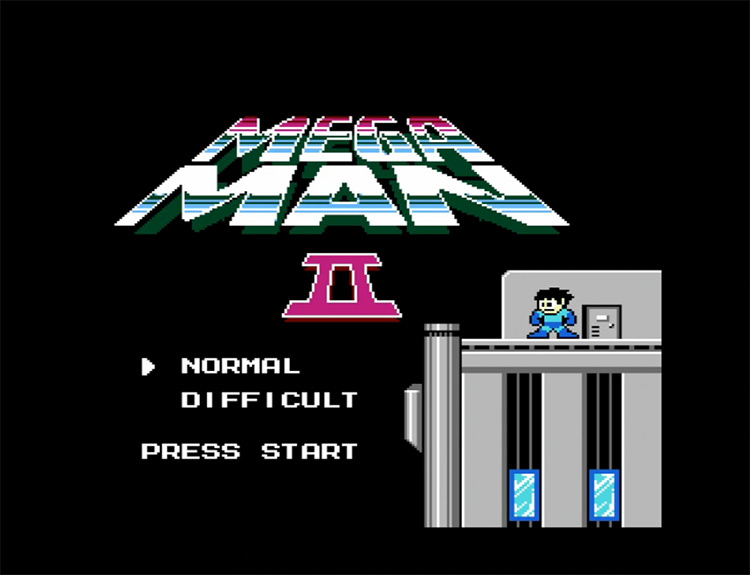
At the pinnacle of 8-bit jump-and-shooting stands Mega Man 2 – arguably the best title in the series, and one of the best video games of all time. Right from the beginning, the game tells you to get ready for something big. Mega Man stands proud atop a skyscraper, his hair swaying in the wind, with a face of pure determination – as much as could fit on a tiny 8-bit sprite. This title screen accurately reflected the bombastic experience lying beyond the “Press Start” prompt.
13. Pokémon Gold & Silver (2000)
Pokémon Gold & Silver’s title screen is not only a cherished memory, but also a common ground for a generation of video game fans. Just like Ash did right at the beginning of the anime, we catch a glimpse of the legendary Ho-Oh flying high over the Johto region in Gold. Or alternatively in Silver, we’ll watch Lugia zooming over the seafloor. These games brought massive improvements over the original games. And these title screens told you right from the get-go.
12. Halo: Combat Evolved (2001)
Halo was one of the most compelling gaming experiences of the early 2000s – largely thanks to its polished, novel take on first-person shooter staples, exciting setting, and inspiring story. And its title screen shows us a colossal ring spinning around a planet. This mysterious structure with the size to house its own landmasses and oceans was just mind-blowing at the time and accurately reflected the scale of Halo’s conflict. In fact, this title screen is all about scale. The scale of this artificial world, the technological advances needed to make it, and the epic journey ahead.
11. Portal 2 (2011)
The sequel to Valve’s acclaimed puzzle-platformer Portal builds on the original’s excellent puzzles with a masterfully written storyline and hilarious humor. Portal 2’s title screen reflects this new emphasis on narrative by changing as the player progresses through the campaign. Each one is somehow related to the story’s current events, and they’re all as beautiful as they are haunting. The music also changes to match the tone of your adventure – going from suspenseful atmospheric music to high-intensity electronic pandemonium.
10. The Elder Scrolls V: Skyrim (2011)
Nothing screams “adventure” like a choir of presumably muscular Nords joining their voices to sing about the legendary hero who’ll save the world from the yoke of the dragons. The title screen for Bethesda’s beloved action RPG is simple in design – just some smoke, the Seal of Akatosh, and the Press Start prompt. It’s the music that really elevates it – and that’s the reason it remains fresh in our hearts and minds. It starts out quiet, then grows into a roaring Nord hymn. In a way, it’s a lot like the average New Game.
9. Super Mario World 2: Yoshi’s Island (1995)
In 1995, the game industry was headed fast toward 3D gaming – and any sort of three-dimensional elements seemed to drive the public wild. Yoshi’s Island on the SNES features a gorgeous pseudo-3D title screen that showcases the game’s storybook graphics by giving players a glimpse of every World they’d visit with the 16-bit equivalent of a drone shot around the island. At the time, it was a gorgeous technical flex that gave players that “bigger and better” feeling we expect from the sequels to our favorite titles.
8. Super Mario 64 (1996)
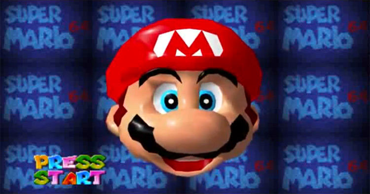
Yoshi’s Island wasn’t the last time Nintendo decided to play around with 3D graphics for their title screens. They did it again for Super Mario 64 – except this time, it was actually polygonal. The title screen for Super Mario 64 features a giant 3D model of Mario’s face you can twist and pull into funny new shapes while an iconic tune plays in the background. Playing around with Mario’s face proved so fun, it eventually became a Mario Party mini-game. Nintendo’s philosophy has always been that video games are – at their core – toys. And everything about video games should be fun in one way or another. Of course, that includes title screens.
7. Call of Duty: Black Ops (2010)
Everything about Call of Duty: Black Ops had a ton of style and uniqueness that set it apart from the critically acclaimed CoD: Modern Warfare 2 – and it wanted to let you know ASAP. Strictly speaking, the title screen was just a bad-ass soldier sitting down toward the player with a handgun in each hand. Memorable, but not ranking-worthy. Still, I can’t possibly overlook the game’s main menu – in which you are tied to in a creepy interrogation room. You could even wiggle around and eventually break free for a chance to play the classic text-based adventure Zork on the nearest computer.
6. Spec Ops: The Line (2012)
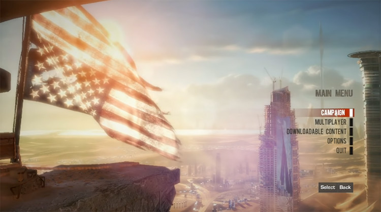
One more military psycho-thriller game with a fantastic title screen is Spec Ops: The Line. Yager Development put a lot of effort into telling a military story that didn’t shy away from addressing the dark side of war – and it uses everything, from its loading pauses to the title screen, to get the message across. At first, The Line’s title screen depicts a typical scene of a sniper overlooking Dubai – but as the story unravels, the scene takes on an increasingly grim tone. It’s poignant and undeniably memorable.
5. Super Metroid (1994)
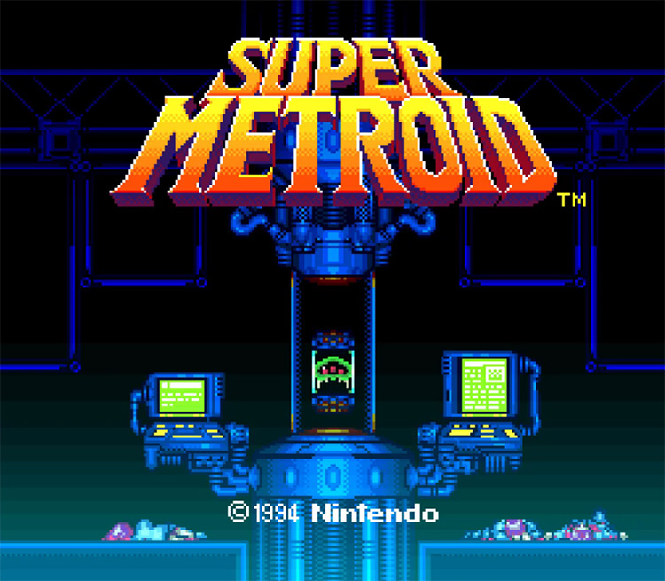
Even among all the games on this list, nothing is quite as memorable as Super Metroid’s iconic animated title screen. Behind the game’s bright logo, we can make out a macabre scene depicting some very dead scientists who were seemingly studying a captive Metroid. Leave it alone for a bit and it’ll start cycling through similarly exciting scenarios. Not only was it very flashy and exciting for gamers at the time, but it could actually give you some hints to help you access certain secret areas. It’s also a very minimal way of clearing up some shaky plot points.
4. The Legend of Zelda: Ocarina of Time (1998)
Ocarina of Time was probably the first game I ever booted up on my own – and its title screen was instantly burned into my retinas. The game opens with a shot of Link riding his horse over beautiful green hills, the moon shining overhead. Slowly the game’s logo fades in, with a golden fire burning around it like a warning that what you’re about to play is powerful. The background cutscene continues to play, showing us the Moo Moo Ranch and the walled city of Hyrule. And who could forget the music? This title screen promises a grand adventure, which Ocarina of Time undoubtedly delivers.
3. Xenoblade Chronicles (2010)
Most players agree that Xenoblade Chronicles is a masterpiece of title screen design. It does a great job of suggesting what the game is about without spelling it out. It focuses on the massive world you’re about to explore – and how the Monado sword is the key to the narrative. What’s best is that it does all this while looking absolutely fabulous. The blades of grass moving in the wind, the gorgeous sunset, and the star-lit night are enrapturing. It’s one of those title screens you can’t help but watch just a little longer every time.
2. Dragon Age: Inquisition (2014)
Another tremendous animated title screen that does a fantastic job of outlining the following narrative and showing off the game’s appealing graphics belongs to Dragon Age: Inquisition. This dynamic scene presents the massive conflict you’re about to take on – the war between Mages and Templars – by showing an endless stream of soldiers marching in parallel toward a far-away tower. Yet what I like the most is how it ends. A massive magical explosion coming from the tower blasts everyone away when choosing to play a New Game or load one. The game picks up minutes after the explosion, with your character being held prisoner under suspicion of having caused the catastrophe.
1. Detroit: Become Human (2018)
Quantic Dream pulled out all the stops to make Detroit: Become Human the most appealing cinematic experience possible – beginning with the title screen and main menu. This game’s front desk is hosted by Chloe – a gorgeous android who presents the game and offers commentary every time you return to this screen. While hearing her bad jokes and interesting comments about the world of Detroit: Become Human is enjoyable, Chloe is at her best when giving you her opinion on your in-game actions. Depending on your route throughout the narrative, she may even develop a conscience and ask you to set her free. She’ll really leave if you do, so consider your options wisely.


